Art Basel 2016 Happened: the Postmortem
Art Basel 2016 happened. The final report showed the highest sales in years, replacing fear and desperation with confidence. Money changed hands, people had fun and there was a lot of interesting art to see. I would like to post a few of my favorites.
Galerie Nathalie Abide (Paris)
Mickalene Thomas
Celie
2016
Silkscreen ink and acrylic on acrylic mirror mounted on wood panel
182.9 × 152.4 (cm) 72.0 × 60.0 (in)
Image courtesy of Galerie Nathalie Abide
If you missed Mickalene Thomas’ recent exhibition, Mentors, Muses and Celebrities that concluded her residency at the Aspen Art Museum, Galerie Nathalie Obadia gave Art Basel visitors a little taste with Celie (2016).
“I’m using these scenes by abstracting them from the film (The Color Purple) and claiming and presenting them as these mirror images of who we are and how we related one another. In Ms. Celie’s Blues, I show the moment when they are at the club and Shug is singing to Celie, and she is siting at the table like a little girl feeling lost and out of place. Then suddenly the room parts because Shug is focused on her and she is saying, basically, “You are everything.” For me, that moment goes toward philosophies like [Jacques] Lacan’s notions of beauty, which basically says we don’t necessarily see ourselves until we look into a mirror; we can be those mirrors when we see ourselves in each other and have a sense of validation.”
Mickalene Thomaa
Interview Magazine
Lehmann Maupin (New York)
Kader Attia has been a favorite since The Repair from Occident to Extra-Occidental Cultures at Documenta 13. I felt that the installation was the most powerful work in the festival and the works that have followed have not disappointed. Attia uses the archive, with all of its intimidating qualities, to subvert its original function of oppression and misinformation.
Kader Attia
The Culture of Fear: An Invention of Evil
2013
Installation
Image courtesy of Lehmann Maupin
The booming newspaper industry of the 19th century provided the platform for an intense questioning of the relationship between the West and non-Western cultures. Visual representations were dominated by a depiction of the ‘wild man,’ a dark and brutal alter ego of the modern Western male. This visual propaganda, distributed throughout and by the Western press, served to shape nationalist and Eurocentric worldviews still perpetuated today. Kader Attia’s installation here consists of a sequence of shelves filled with newspapers and books from the late 19th and early 20th centuries as well as from today. They depict scenes from colonial history: non-white men (Africans, Arabs, Berbers or Native Americans) committing despicable crimes or acts of violence. Their victims are exclusively white, and foremost women. Attia explains: ‘Political powers and today’s media revive a secular fear that was born during the crusades, and it is exactly this hegemonic Western iconography that has infused peoples’ psyche for centuries. What media and political powers tirelessly represent as new violence is actually the continuity of a centuries-long conceptual construction of harmful Otherness: the invention of evil, the decisive element of the policy of fear.’
Kader Attia
The Culture of Fear: An Invention of Evil
2013
(detail)
photo by Terrenceo Hammond
Kader Attia
The Culture of Fear: An Invention of Evil
2013
(detail)
photo by Terrenceo Hammond
Sprüth Magers (Berlin)
Thomas Ruff
press++32.08
2016
C-Print
225.0 × 185.0 (cm) 88.6 × 72.8 (in)
Image courtesy of Sprüth Magers
Thomas Ruff
press++25.21
2016
C-Print
185.0 × 225.0 (cm) 72.8 × 88.6 (in)
Image courtesy of Sprüth Magers
The German photographer Thomas Ruff’s “press++,” comprises space-age images culled from the archival clippings of various American newspapers. Ruff scanned both sides of the original documents and layered them in Photoshop, thus presenting both the photos and the context—the smudges, cropping, commentary, and retouching—that surrounded their initial publication. “I think photography is still the most influential medium in the world, and I have to deconstruct these conventions,” he told Aperture in 2013:
“I try to find out how the image was created and in what context—historical, political, or social—the image belongs … There are a lot of different photographs, and different photographs have different intentions. Fine art, medical, propaganda, and of course the most influential image-production machine is advertisement. This transformation, let’s say, of the scientific photography into the art world, or advertising photography into politics (as seen in the last U.S. election)—this modification of images from one intention to another brings about interferences. The image, and the meaning of the image, changes.”
Paris Review
Stevenson (Cape Town)
Ntozakhe II, Parktown (2016) is part of Zanele Muholi’s series of self-portraits titled Somnyama Ngonyama, meaning ‘‘Hail the Dark Lioness.’’
Zanele Muholi
Ntozakhe II, Parktown
2016
Photography
110.0 × 81.8 9 (cm) 43.3 × 32.2 (in)
Image courtesy of Stevenson
Photography, Muholi says, is her therapy: a daily prayer, written out in the positioning of her limbs and the look haunting her face. She thinks of these self-portraits as autobiographical. They explore the elements of her personality — female, African, gay — and where they blur together and pull apart. She wants to undo the damage of growing up in a society that drew its strength from demonizing blackness, which is part of the reason she drastically darkens her skin tone in the photographs. It is her most deliberate declaration that she is black and that she is beautiful.
Muholi reaches, “deep into herself, sucking out the troubled history in her marrow. Her self-portraits explode stereotypes of African women while evoking them, implicating the viewers for summoning those clichés as they gaze upon her skin.”
NY Times
Hauser & Wirth (Zurich)
Paul McCarthy’s Tomato Head (Green) sold early in the fair to an American collector with great taste and a cheeky sense of humor. $4,750,000 well spent.
Paul McCarthy
Tomato Head (Green)
1994
fiberglass, urethane, rubber, metal, plastic, fabric, and metal base
Image courtesy of Hauser & Wirth
In one of his most important works from the 1990s, Tomato Head (Green), Paul McCarthy creates a life-size comic figure to explore the relationship between modern culture, consumerism, and innocence. The allegories of a beloved and immediately recognizable cast of characters have been subtly changed or adulterated to produce unsettling and unnerving works. Tomato Head (Green) plays on the name and appearance of the iconic children’s toy Mr. Potato Head. McCarthy’s human figure with an enlarged cartoonish tomato as a head transforms the notion of a children’s toy into a sinister work of art that perturbs certain aspects of American culture.
Blum & Poe (Los Angeles)
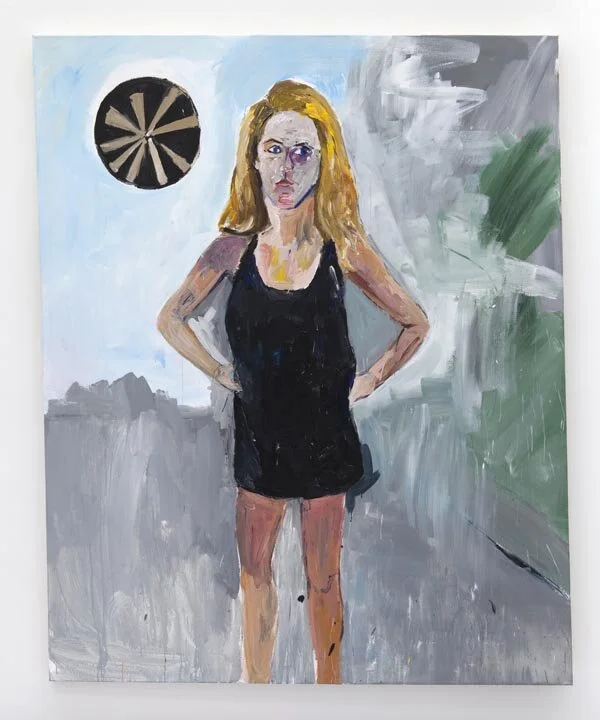
Henry Taylor’s style of painting can blur the line between the figurative and the abstract.
Hyperallergic: Letting Go of the Distinction Between Figuration and Abstraction
Henry Taylor instills his paintings with a multitude of observations, portraying not only the subject, but also a broader social stance. Grounded in realism and energized with a raw simplicity and idiosyncratic detail, his paintings address both political and historical concerns related to the human condition. In Taylor’s hands, the canon of portraiture is not merely a convention, but rather a system through which the artist processes his views, travels, and interactions.
Henry Taylor
Everyone’s Momma
2013
Acrylic on canvas
320.0 × 191.1 × 8.3 (cm) 126.0 × 75.2 × 3.2 (in)
Image courtesy of Blum & Poe
Henry Taylor
Diana Sofia, Riding in the Kitchen
2014
Acrylic on canvas
161.9 × 116.8 (cm) 63.8 × 46.0 (in)
Image courtesy of Blum & Poe
Henry Taylor
Lauren Christensen
2015
Acrylic on canvas
213.4 × 172.7 (cm) 84.0 × 68.0 (in)
Image courtesy of Blum & Poe
Some consider Taylor an outsider artist because of his painting’s formal resemblance to folk style with its vibrant and loose brush strokes, and his fickle relationship with orthodox learning. However, when asked about it by a writer for the Observer, he responded “I say to hell with all that shit.” He received his art degree at CalArts in his 30s while working as an aide to the mentally ill at a hospital, only to reject his training in conceptual art and return to a prolific approach to making art. Because the artist moves quickly, things that inspire him must come within a swift reach.
Artslant
Goodman Gallery (Johannesburg)
I had to mention South Africa’s Goodman Gallery in this article because they slayed Art Basel with interesting work and well-deserved sales.
William Kentridge
Untitled (Patrice Lumumba III)
2016
Work on Paper (Indian ink on found pages )
87.0 × 78.5 (cm) 34.3 × 30.9 (in)
Image courtesy of Goodman Gallery
“Goodman Gallery from Johannesburg and Cape Town placed at least 10 works, with prices ranging from 3,000 euros to $320,000 for a piece by William Kentridge.”
Bloomberg
“South Africa’s Goodman Gallery also found success, selling Kentridge’s Patrice Lumumba (2016) for $120,000 and a full set of his Shadow Figure Bronzes (2016) for $320,000. Other works that found buyers included Walter Oltmann‘s Caterpillar Suit IV (2016) for €25,000 ($28,000), Kudzanai Chiurai’s painting Untitled (Office for the Enregisterment of Slaves) (2016), for $30,000, and Nolan Oswald Dennis’s ink and collage on paper, No conciliation is possible I (2016) for €3,500 ($3,900).
Artnet
Additional photos by Terrenceo Hammond


